Typeface Pamphlet (Baskerville)
This project focused on designing an informational pamphlet for a selected typeface. Baskerville was chosen for its refined, classical qualities, with a concept inspired by its connection to Canadian identity.
The goal was to create something that feels both informative and engaging, while still honoring the elegance and history of the typeface.
Problem:
The challenge was presenting information about the typeface in a way that feels clear and engaging, without losing its refined and classical character.
It needed to communicate key details without becoming overly dense or visually flat. Something that invites reading, rather than overwhelming it.
Strategy:
The approach focused on reflecting the refined qualities of Baskerville while incorporating subtle elements inspired by its use in Canadian identity. Red accents and simple maple leaf imagery were paired with structured shapes to create a balance between elegance and visual interest.
Additional content, such as fun facts, was included to make the information feel more approachable and engaging, without taking away from overall tone.
Design:
The final design uses a structured layout and clear typographic hierarchy to present information in a readable and refined way. Red accents and maple leaf imagery are woven throughout a blue and white palette, creating a visual connection to the concept.
A strong visual element on the back of the pamphlet reinforces the overall identity, helping the piece feel complete and intentional.
Outcome:
The result is a clear and engaging typeface pamphlet that communicates key information while maintaining a refined and cohesive visual identity. It balances structure with personalty, creating something that feels both informative and quietly expressive, with a sense of energy inspired by its connection to Canadian identity.
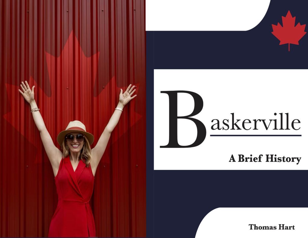
Exterior of the pamphlet showing the overall structure and visual concept.
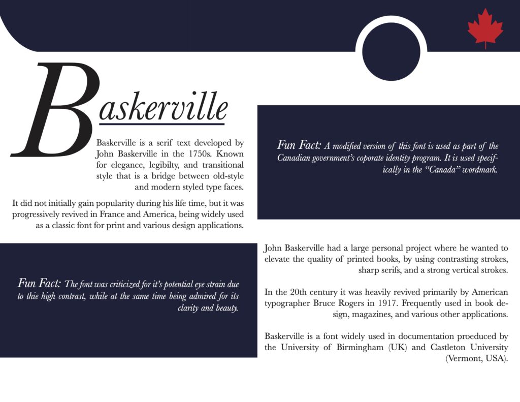
Interior of the pamphlet introducing the typographic system and overall design.