Utah Tenant Law Website – Visual Content Exploration
This client project explores ways to enhance the readability and user experience of a legal information page focused on Utah’s Fit Premises Act. While the content is clear and informative, this phase focuses on introducing visual and structural elements to support easier navigation and understanding. Through collaborative concept development, different approaches were explored to create a more accessible and engaging experience.
Problem:
The page presents clear and informative legal content, and as it continues to develop, this phase of the project focuses on exploring ways to support readability and was of navigation. The goal was to identify opportunities to help users more quickly scan and understand key information while maintaining clarity of the original content.
Strategy:
A collaborative and exploratory approach was used to identify ways to enhance the page’s usability while respecting the existing content. Initial concepts focused on improving structure and scalability through clearer sectioning, visual hierarchy, and the introduction of supportive elements such as charts, checklists, and selective imagery. Multiple directions were developed to allow for flexibility, giving the client space to respond to different visual approaches without pressure to make immediate decisions.
Design:
Multiple visual concepts were developed to explore ways of presenting key legal information in a more accessible format. Initial drafts were created for two primary content areas – “Safe and Habitable Home” and “Tenant Rights vs. Landlord Responsibilities” – with three variations for each, allowing space for early feedback and direction setting.
Based on that feedback, a series of refined infographics were created, combining clear text with supportive iconography to improve readability and quick understanding. These designs focused on balanced layouts, intentional spacing, and consistent visual structure to break up dense information into more digestible sections. Some variations also included flexible elements, such as placeholders for a law firm name, and a color scheme that that gives subtle regional references to Utah.
The color choices remained cohesive throughout, using a range of teal tones with complementary accents and occasional contrasting colors to maintain a professional yet approachable feel. Across all designs, the goal was to present legal information in a way that feels clear, trustworthy, and accessible – reducing overwhelm while preserving the integrity of the content.
Outcome:
This phase of the project resulted in a set of clear, visually structured infographics designed to support the readability and usability of the page. By translating key information into more digestible formats, the designs provide a foundation for a more scannable and approachable user experience.
The collaborative and iterative process also helped establish a clearer visual direction, giving the client tangible options to respond to while reducing the pressure of making abstract decisions. This approach created forward momentum, allowing both clarity and flexibility as the project continues to develop.
Role:
Visual Designer & Information Design Support
Client Review:
Thomas’s graphic design work for the Utah tenant law habitability page demonstrates a combination of clarity, restraint, and conceptual understanding. The visuals are elegant without feeling ornamental, and simple without sacrificing substance. this is an especially difficult balance to strike in a legal context.
What stands out most is Thomas’s ability to translate nuanced legal standards into intuitive visual structures. The graphics do more than decorate the page; they they actively guide the use’r’s understanding Key habitability concepts, often dense and abstract in statutory language, are organized into clean, digestible visual hierarchies that make the information more accessible without oversimplifying it.
His design choices show a strong sensitivity to context. The graphics integrate seamlessly with the site’s existing color scheme and branding, enhancing the overall user experience rather than competing with it. The result is a cohesive visual language that feels intentional and professional.
Equally notable is the creativity embedded within these constraints. Thomas avoids both the sterility that often characterizes legal design and the over-stylization that can undermine credibility. Instead, he delivers work that is pragmatic, thoughtful, and quietly innovative.
– Victor, Attorney at Law
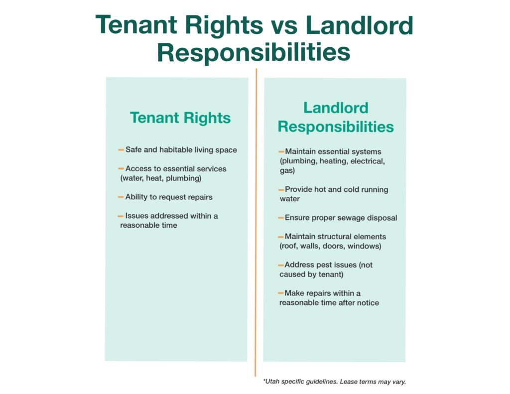
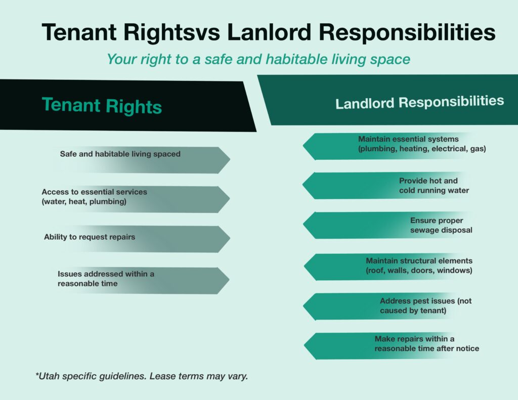
Exploration Drafts: Testing layout, and information grouping.
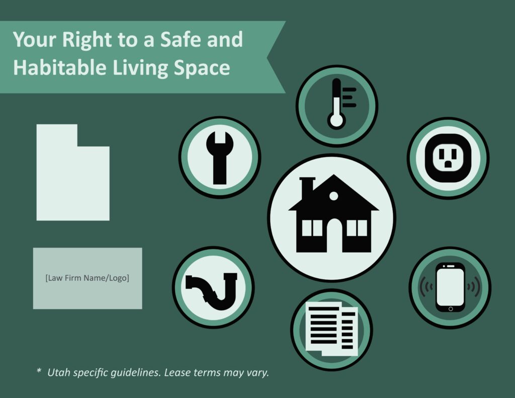
Final: Refined direction with improved clarity, spacing, and visual structure.
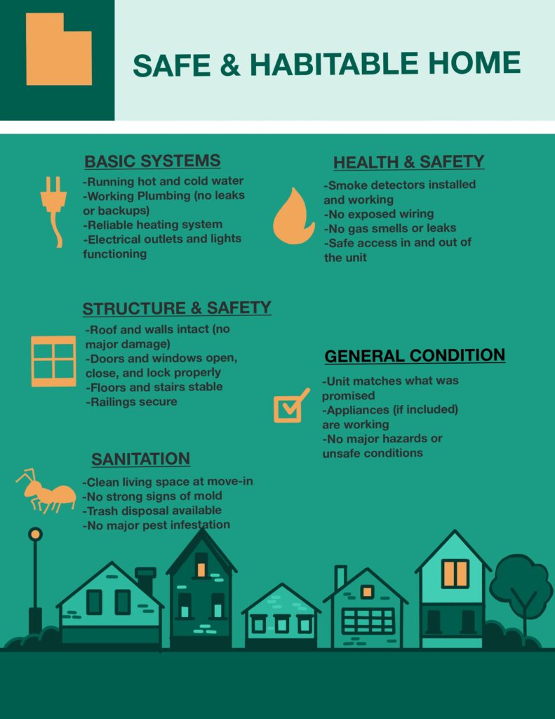
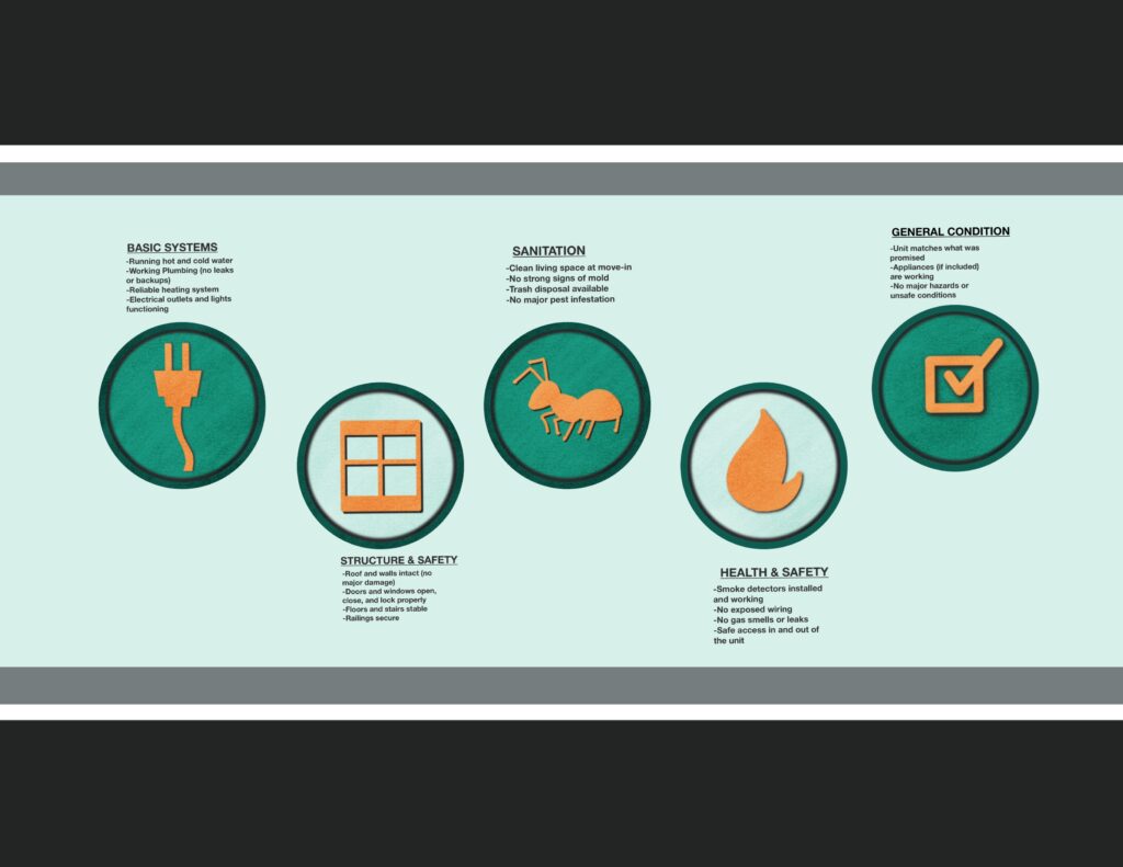
Exploration Drafts: Testing layout, icon information grouping, and icon placement.
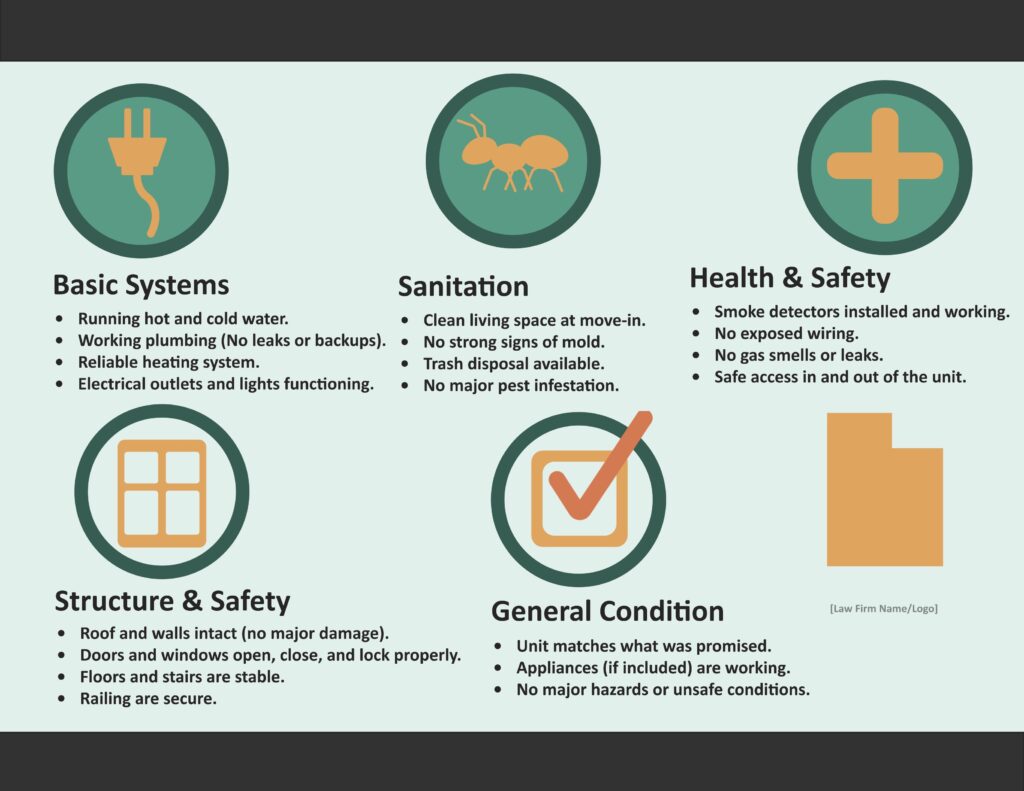
Final: Refined direction with improved clarity, spacing, and visual structure.