Newspaper Layout
This project focused on designing a newspaper layout using multi-column grid system, with an emphasis on creating something that feels both structured and believable. The goal was to move beyond a basic layout exercise and build something that feels complete. Like a real publication someone could pick up and read.
Problem:
The challenge was creating a layout that feels clear and readable, while also making the newspaper feel full and intentional rather than empty or repetitive. A newspaper relies on more than just structure. It needs content, variation, and rhythm to feel real. Without that, even a well designed layout can feel flat.
Strategy:
The approach focused on developing both the layout and the content together to create a more complete and immersive experience. By combining inspired and original stories, quotes, and moments of humor, the newspaper began to feel more dynamic while still maintaining a clear and structured foundation.
The goal was to create something that feels engaging to more through, not just visually organized.
Design:
The final design uses a multi-column grid and structured typographic hierarchy to organize content clearly. Texture, color, and layout choices were used to mimic the look and feel of a traditional printed newspaper.
Real imagery and detailed elements such as headlines, sections, and publication information, help build a cohesive composition, making the layout feel intentional and fully developed rather than staged.
Outcome:
The result is a detailed and engaging newspaper layout that feels complete and believable. It combines structured design with original content to create an experience that feels immersive, readable, and grounded in a real world context.
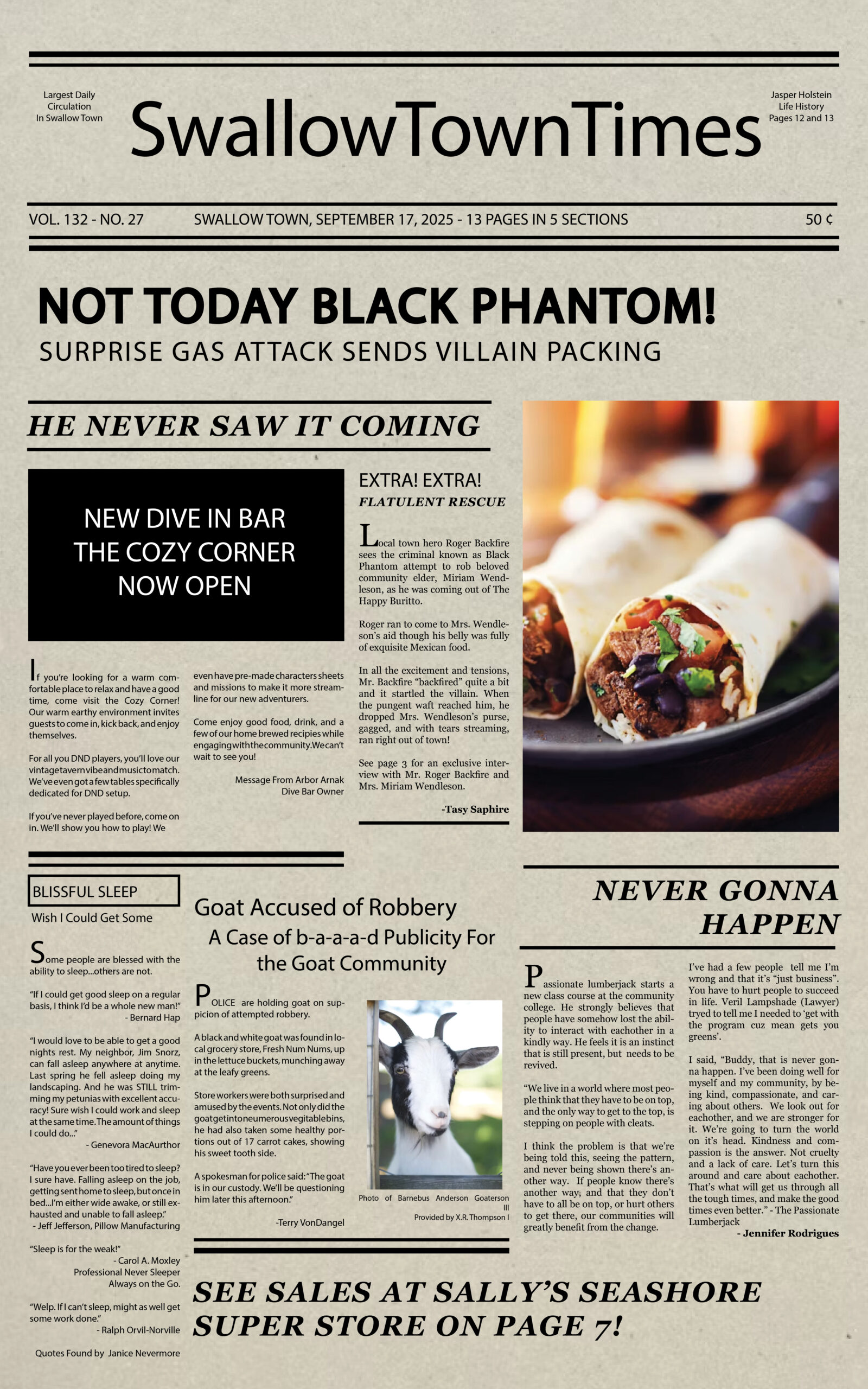
Newspaper layout showing the full multi-column system and how the content works together to create a complete, readable, experience.