Pulsar Thrust Space Defense
This project focused on designing a business card for a fictional company. I chose a space defense company that I named “Pulsar Thrust Space Defense.” The goal was to create something bold and visually engaging, reflecting ideas of movement, energy, and protection within a very small format.
Problem:
The challenge was creating a design that feels dynamic and impactful while still remaining clear, readable, and functional as a business card. With limited space, every element needed to work intentionally, balancing visual energy with clarity so the information stays easy to read.
Strategy:
The focus was on using strong color, contrast, and directional elements to create a sense of motion and energy. The layout was designed to guide the eye naturally across the card, helping the viewer take in the information without confusion.
The goal was to make the card feel active and engaging, without sacrificing structure or readability.
Design:
The final design uses bold color and geometric elements to suggest movement through space, supported by a clean layout and clear typographic hierarchy. The composition balances visual impact with legibility, allowing the design to feel striking while still functioning as a practical contact piece.
Outcome:
The result is a visually engaging business card that communicates a strong sense of identity and energy, while remaining clear and effective as a professional contact piece.
It captures a sense of motion and presence, turning a small format into something that feels dynamic and intentional.

Front of the business card maintaining clarity and structure while reinforcing the overall visual identity.
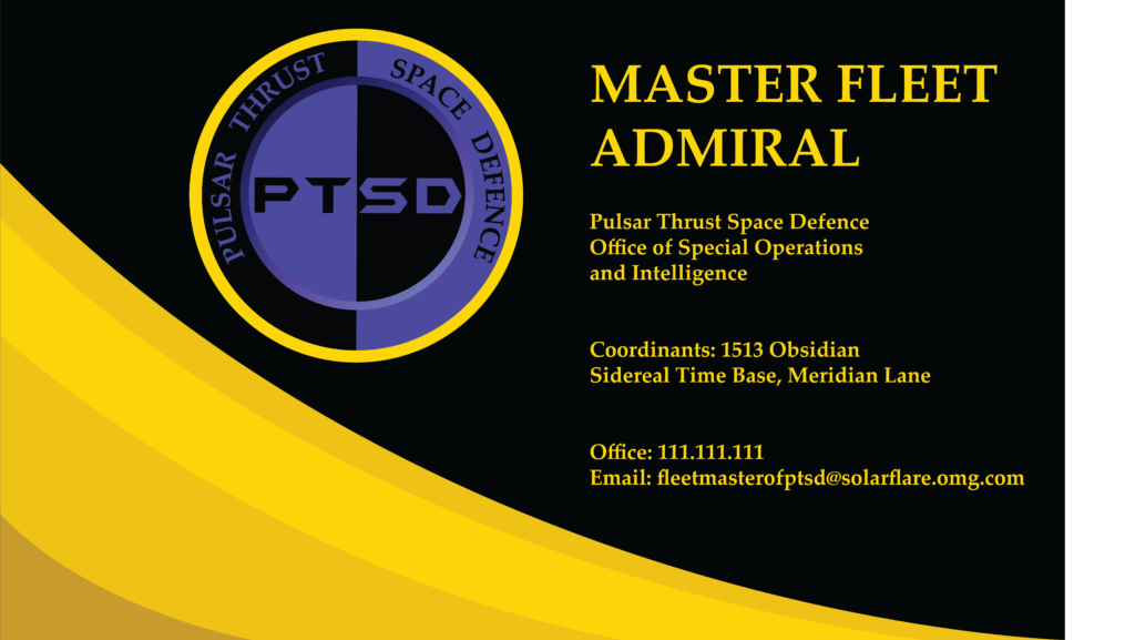
Back of the business card using bold color and directional elements to convey energy and movement.